IoT connectivity platform
Redesigning a data-heavy IoT platform managing 240+ million devices in 180 markets.
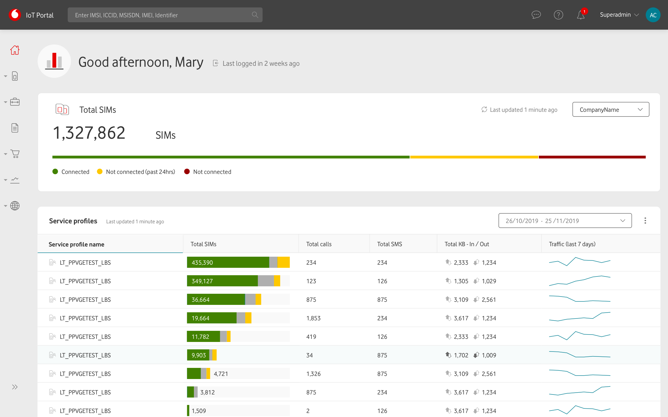
Making a data-heavy platform feel effortless
Vodafone's IoT platform managed millions of connected devices across industries, markets, and user types. The challenge was to make a complex operational platform feel intuitive for both occasional users and power users.
The platform required a rebuild of the underlying experience to handle real-world complexity at scale.
Key contributions
Product designer working end-to-end alongside the PO and BAs, from discovery and research through design, testing, and development support.
Dashboard
Designed a personalised dashboard for a platform used differently by every customer.
Core workflow
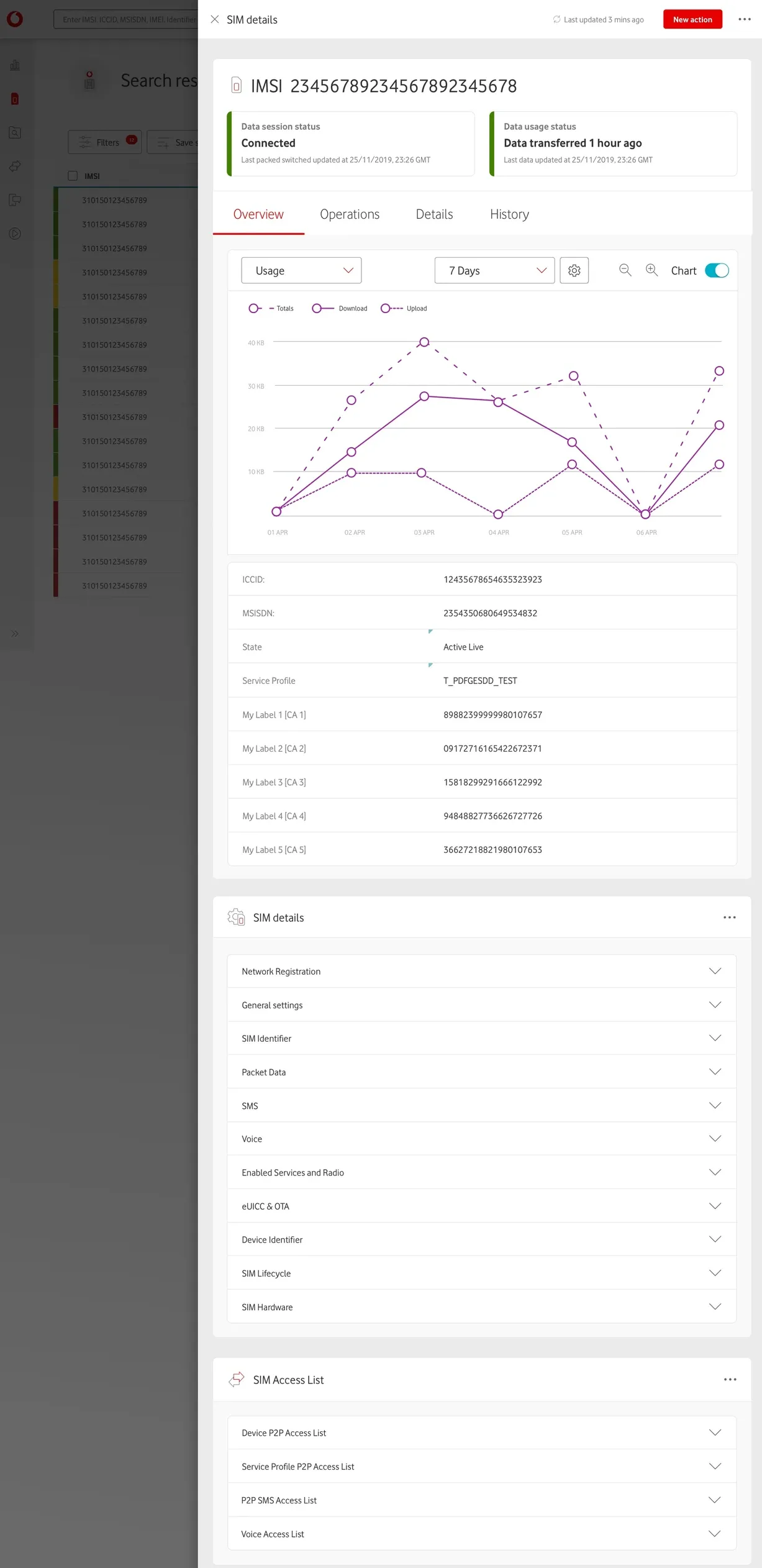
Created contextual navigation for common SIM operations, a simple, low-effort feature that let advanced users work fast.
Advanced prototype
Built an advanced Axure prototype used for frequent testing and requirement validation.
Outcomes
- NPS score shifted from -33 to +62
- Operation completion time reduced to under 10 seconds
- Significant improvement in user satisfaction and sentiment
- Scalable, modern platform serving an expanding global user base
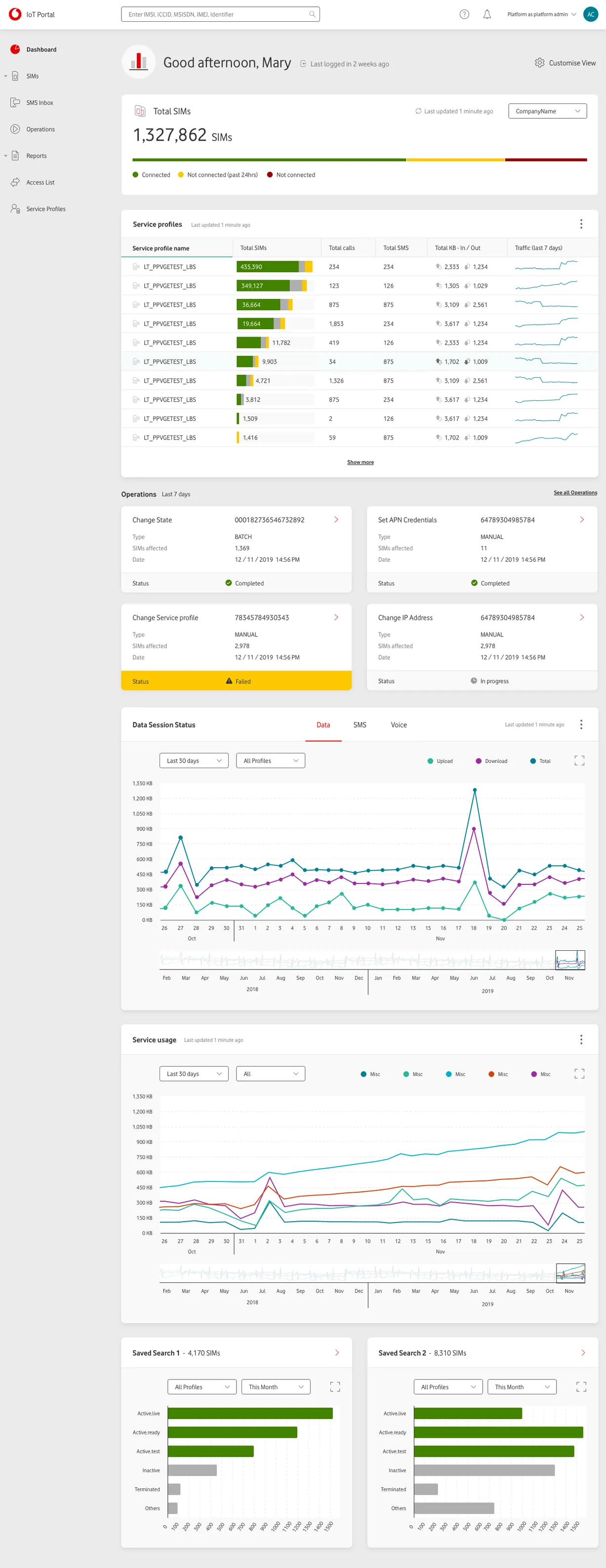
Legacy vs New
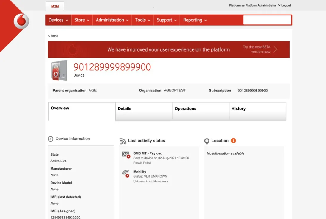
The existing platform couldn't support the operational demands being placed on it. As the IoT industry grew, the gap between what users needed and what the platform could deliver widened.
MVP
The platform had grown past its limits. Slow, confusing navigation, user journeys that fought against the work rather than supporting it. Some users dreaded opening it. The industry was expanding fast, the platform had no way to keep up.
The new platform
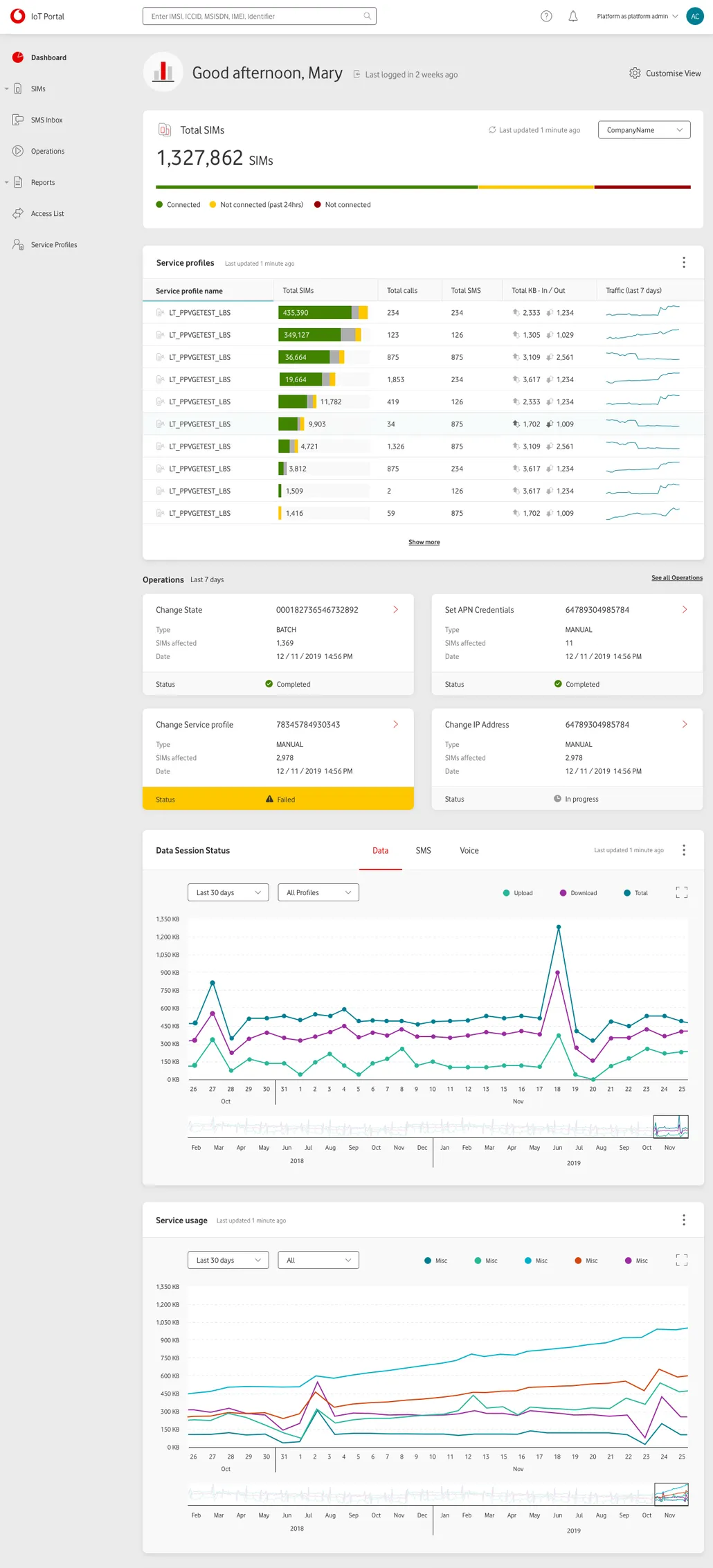
A scalable, modern product built to grow with the user base. Extended design system, improved architecture, intuitive flows for managing complex data and operations. Something users could actually rely on.
Stakeholder interviews
Engaged with subject matter experts and key stakeholders across the business to understand user needs alongside organisational objectives. Keeping stakeholders close throughout meant the final product aligned with both.

Defining user types
The platform served users with wildly different goals, industries, and levels of expertise. Rather than designing for dozens of roles, I reframed the problem around two behavioural user types: users who prioritised simplicity and users who prioritised speed.
This became a foundation for navigation, workflows, onboarding, and dashboard design.
Novice user
→ intuitivity, ease, assurance
Power user
→ speed, shortcuts, contextual actions
Designing for speed and scale
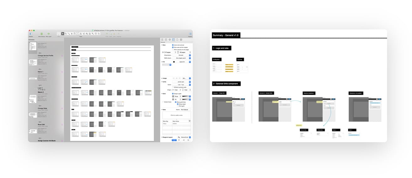
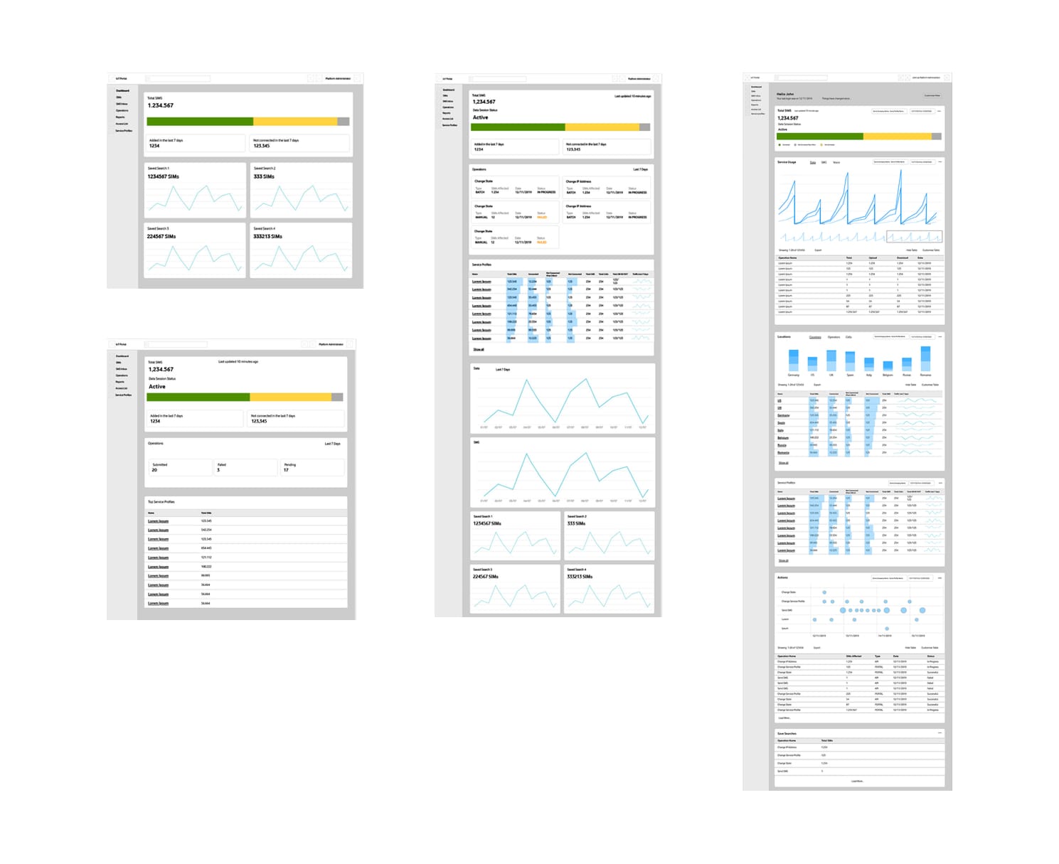
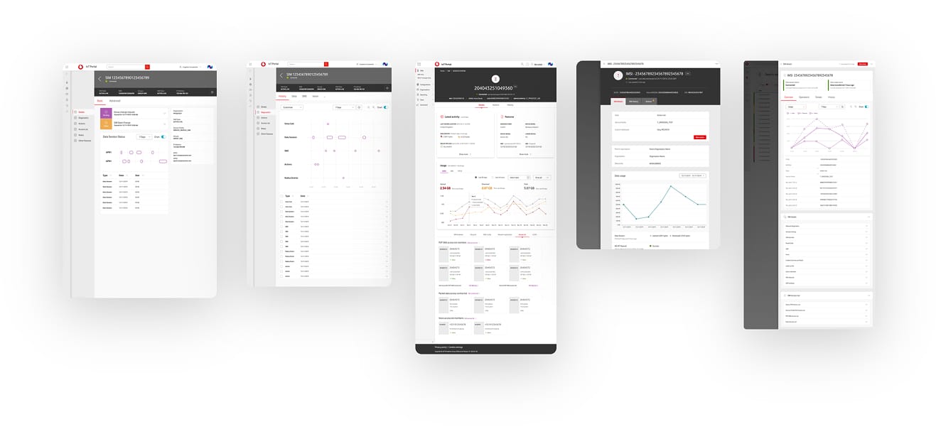
Early exploration happened in Omnigraffle and Axure, where ideas could evolve quickly without the overhead of high-fidelity design. At this stage, speed of learning mattered more than visual polish.
As decisions were validated through stakeholder feedback and user testing, fidelity increased gradually. Each iteration brought more detail, but only after confidence had been earned.
Extending design system
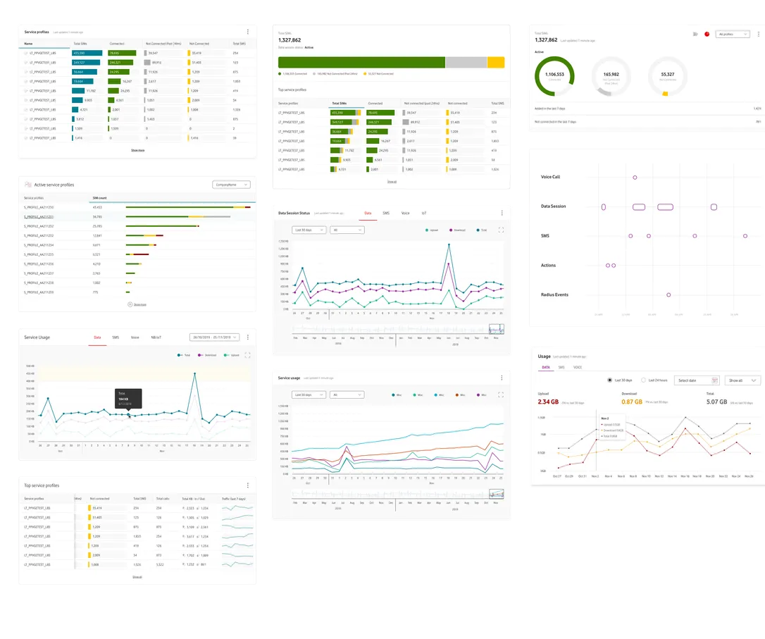
Vodafone had a mature B2C design system, but nothing suited to the complexity of a B2B operational platform. Rather than starting from scratch, I adapted and extended existing patterns to support data-dense interfaces, operational workflows, and future scale.
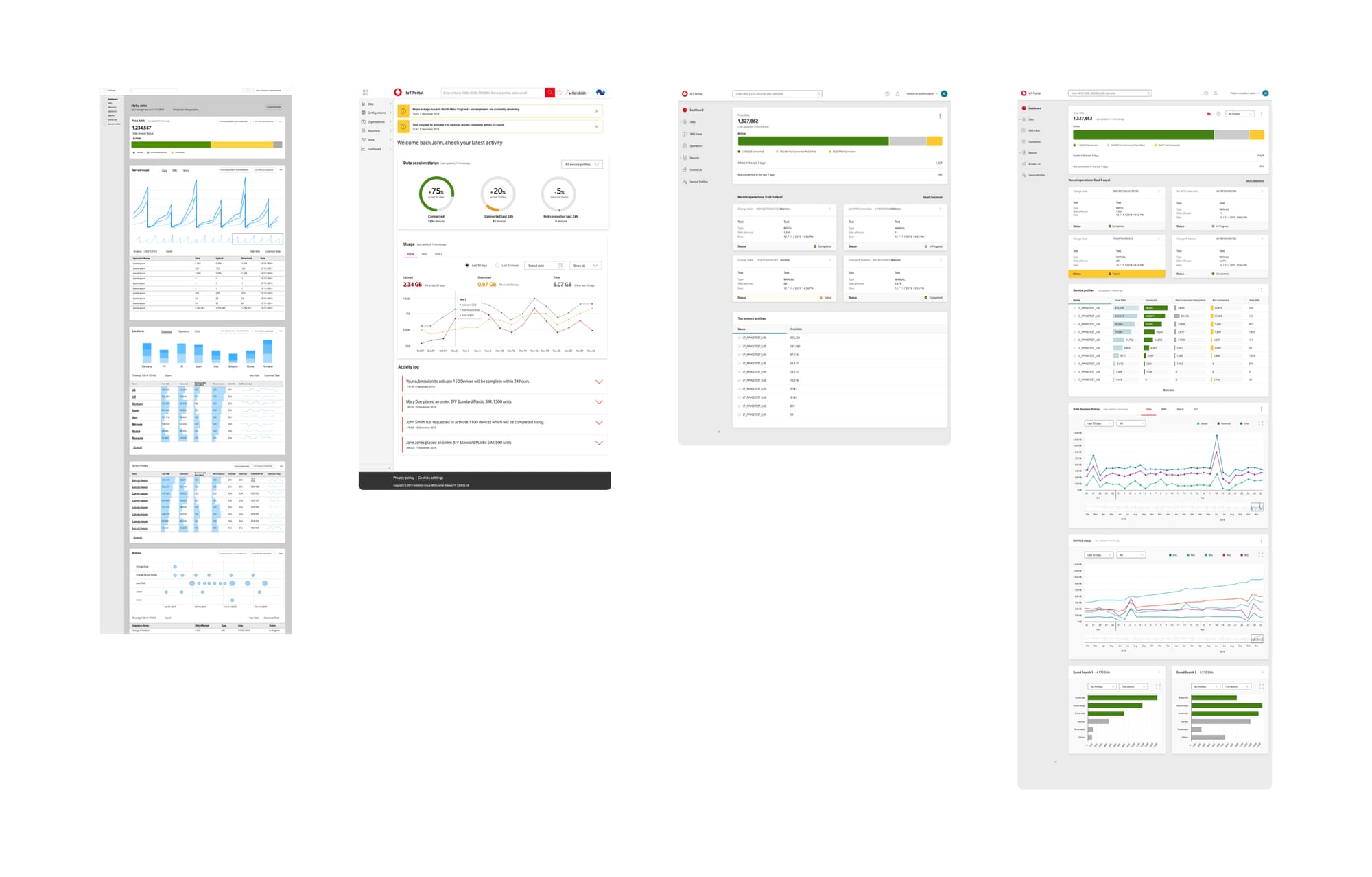
Data visualisation
Managing millions of connected devices meant making complex operational data understandable at a glance.
I researched data visualisation patterns, explored multiple approaches, and designed dashboards that surfaced the right information without overwhelming users. Every chart, metric, and status indicator had to earn its place.
Onboarding and welcome experience
Due to the variety of user types and ways they use the platform, dashboard personalisation was among most desired features.
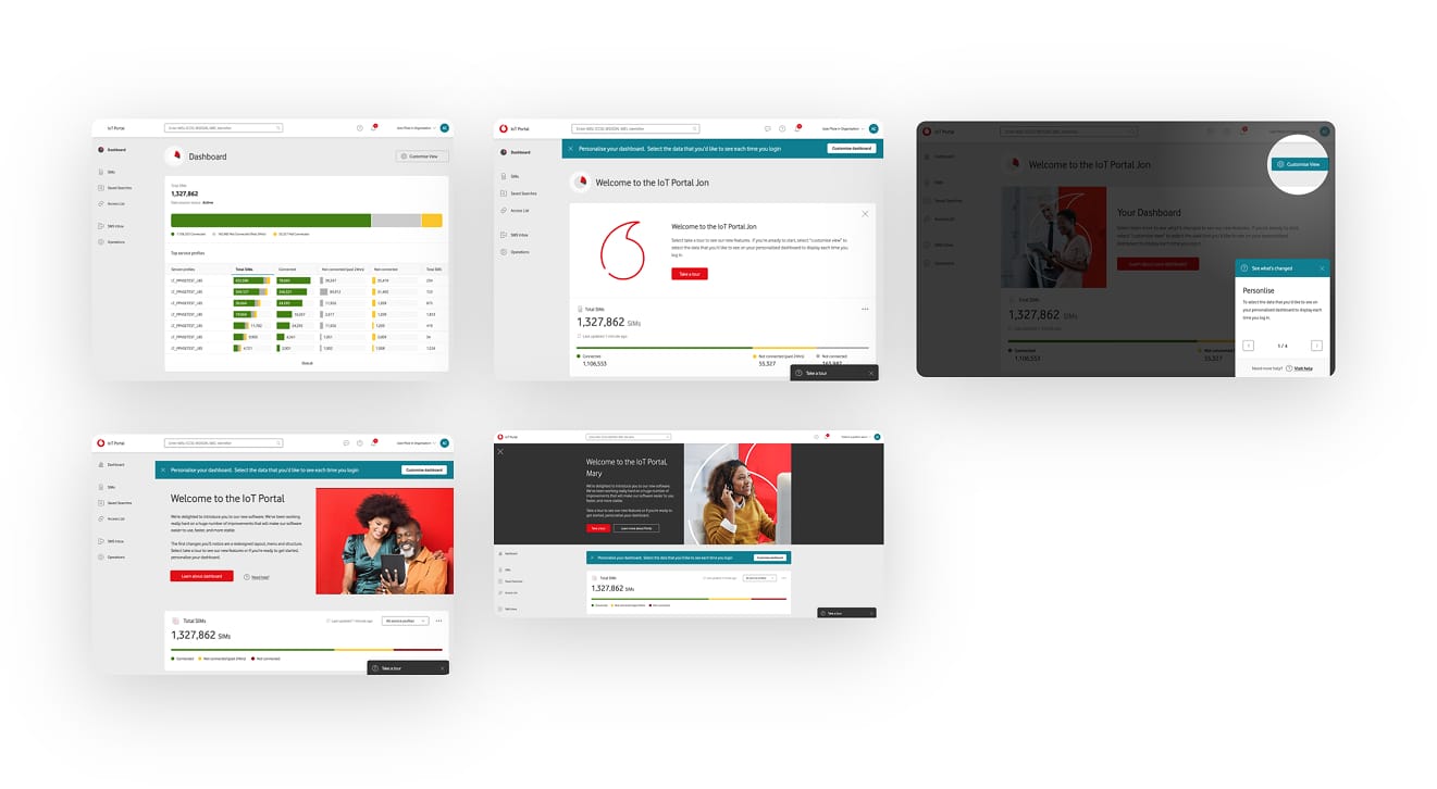
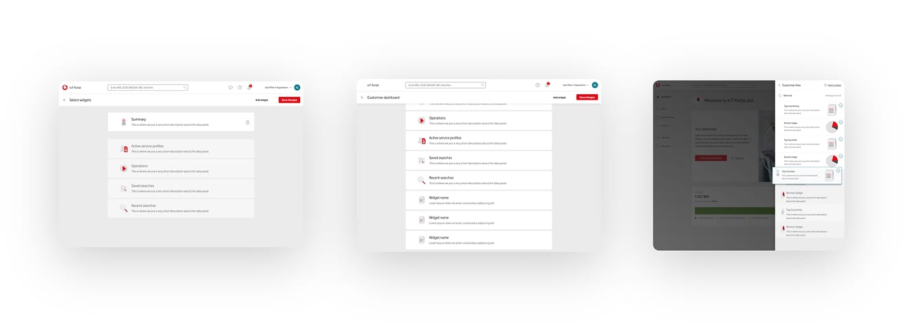
Dashboard personalisation
Dashboard personalisation consistently emerged as one of the most requested capabilities.
I explored several interaction models that allowed users to hide, reorder, and configure dashboard sections, giving them control without increasing complexity.
Small feature, big impact
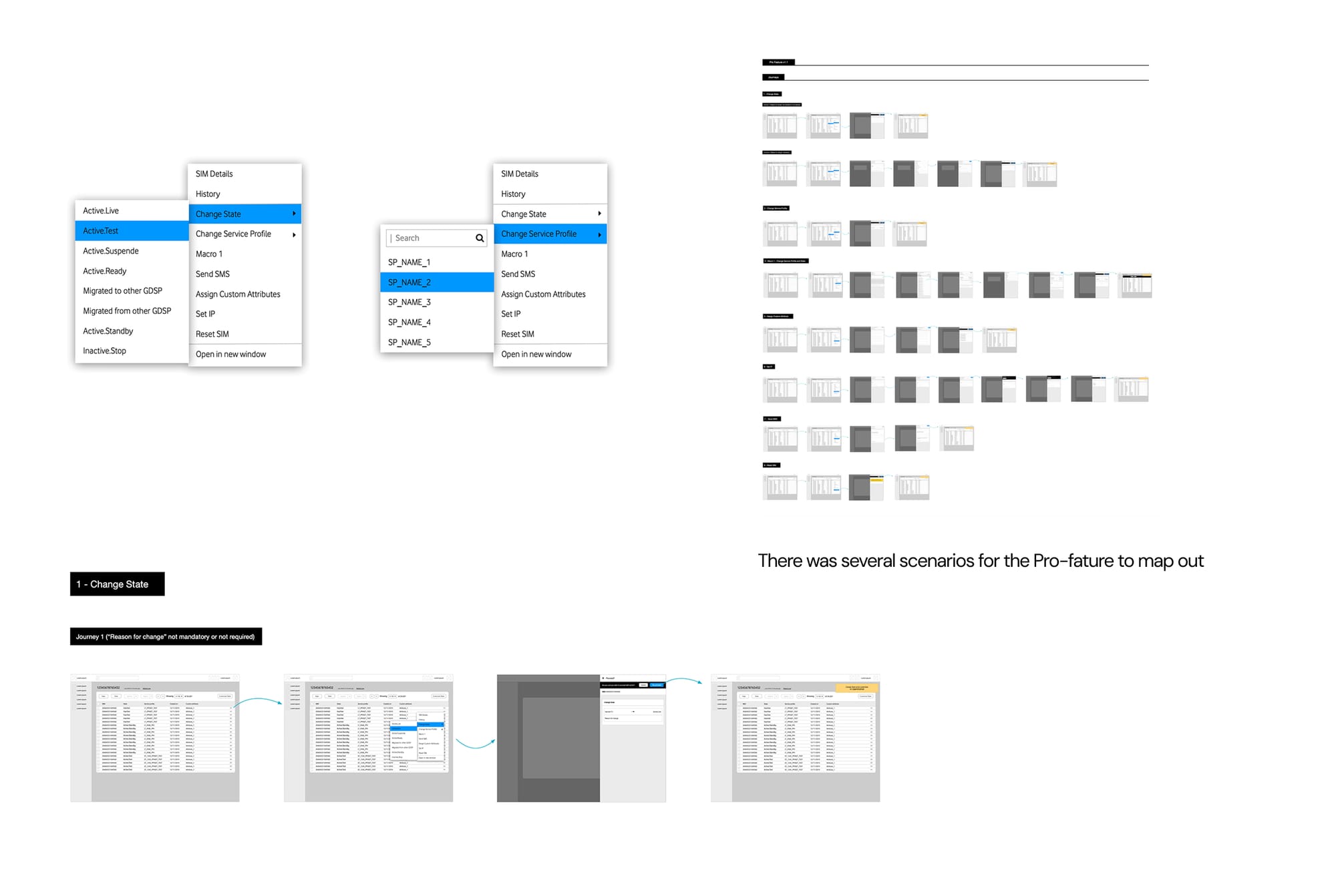
One of the most successful additions was a contextual action menu for common SIM operations.
Power users wanted speed. Rather than navigating through multiple screens, they could perform common actions directly from context.
Simple to build, easy to learn, and repeatedly praised during testing.
Highly interactive protoype
I developed an advanced prototype in Axure, it was used for frequent user testing, and requirement validation.
It was greatly appreciated by the BAs, developers, and acclaimed by the senior stakeholders and wider business.
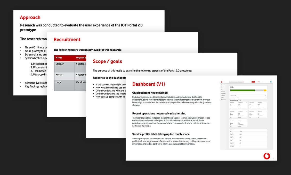
User testing
I created testing plans, facilitated remote user testing sessions with Vodafone customers, collated findings, presented to the team, and refined designs accordingly.
Key learnings
Descoping is design too
Management was optimistic about delivery. Looking back, I'd advocate harder for simplicity earlier, trying to influence the roadmap rather than absorbing scope cuts at the end.
Two personas beat ten
Users varied wildly across sectors and roles. Designing for two skill-based types instead of every individual profile kept the work focused and the outcomes stronger.
The best feature was the simplest one
Contextual SIM operations, low effort to build, high impact in use. A reminder that value doesn't correlate with complexity.
Team player
"Przemek can work solo or collaboratively with others and is a good team player who is open to feedback and criticism. He always seeks to validate his designs with the team, and stakeholders and conducts User Testing sessions."
Venessa Bennett
Vodafone, Design Manager